Customize the Appearance of the Price-Preview Popup
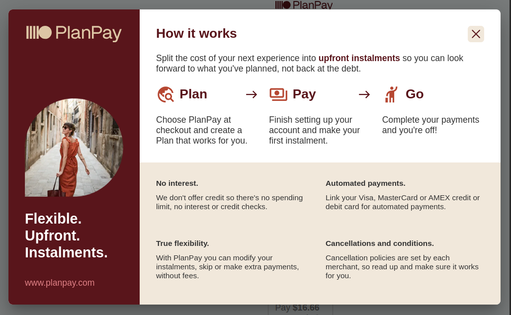
The PlanPay price-preview widget provides a default popup when the widget is clicked. An example of this popup is shown below.

If this popup is appropriate for your use case, no changes are needed from the approach described under Loading the PlanPay widget.
However, should a more customized experience be required, there are two additional options available.
These instructions assume you have already integrated following the guide Loading the PlanPay widget, and only describe how to customize the popup experience.
Make the Popup Behave as a Link
The price-preview widget will behave as a standard HTML anchor and not display the default PlanPay popup when clicked if an anchor tag (<a>) is used as the placeholder/target for the widget and the href property is not empty.
Here is an example of this using the target="_blank" attribute to open the link in a new window or tab:
<a
  data-planpay-data-type="price-preview"
  data-planpay-total-cost="510.00"
  data-planpay-currency-code="AUD"
  data-planpay-redemption-date="2025-12-31"
  data-planpay-payment-deadline="30"
  data-planpay-total-minimum-deposit="25.00"
  data-planpay-merchant-id="62972bbf7919"
  target="_blank"
  href="https://www.planpay.com">
</a>
When this widget loads, it will behave like a standard anchor tag and open the href URL in a new window/tab when clicked.
Call a Custom JavaScript When the Price Preview is Clicked
An arbitrary JavaScript function can be provided in the onclick attribute of the price-preview placeholder. This function will be executed when the price-preview widget is clicked.
It is important to also set the data-planpay-popup="custom" attribute as shown below. Otherwise, the default PlanPay popup will be displayed, even when the custom script is executed. This safeguard ensures that frameworks like React, which may set default noop handlers, correctly opt into the custom popup behavior and suppress the default PlanPay popup.
Here’s an example:
<div
  data-planpay-data-type="price-preview"
  data-planpay-total-cost="510.00"
  data-planpay-currency-code="AUD"
  data-planpay-redemption-date="2025-12-31"
  data-planpay-payment-deadline="30"
  data-planpay-total-minimum-deposit="25.00"
  data-planpay-merchant-id="62972bbf7919"
  data-planpay-popup="custom"
  onclick="(function() { alert('Custom popup example'); })()">
</div>
This example displays a JavaScript alert with the text Custom popup example. However, you can call any script of your choosing.
Common use cases include:
- Opening a custom modal dialog: Display additional product details in a user-friendly way.
- Sending analytics data: Track user interactions with tools like Google Analytics or similar services. If you wish to call a tracking script but still use the default PlanPay popup, you can add the tracking logic to the
onclickattribute or an event handler, while ensuringdata-planpay-popup="custom"is omitted. This allows the default PlanPay popup to display after executing your tracking script. - Redirecting users: Dynamically navigate to another page or URL after interaction.
For a more robust implementation, you can use addEventListener instead of the onclick attribute to handle custom JavaScript logic. This approach is more flexible, provides better separation of concerns, and can improve the reusability of the code.
<div
  data-planpay-data-type="price-preview"
  data-planpay-total-cost="510.00"
  data-planpay-currency-code="AUD"
  data-planpay-redemption-date="2025-12-31"
  data-planpay-payment-deadline="30"
  data-planpay-total-minimum-deposit="25.00"
  data-planpay-merchant-id="62972bbf7919"
  data-planpay-popup="custom"
  class="placeholder"
  id="price-preview-placeholder">
</div>
Then, attach your custom logic in JavaScript:
document.addEventListener('DOMContentLoaded', () => {
  const element = document.getElementById('price-preview-placeholder');

  if (element) {
    element.addEventListener('click', (event) => {
      event.preventDefault(); // Prevent default behavior, if needed
      alert('Custom popup example');
      // Add your custom logic here
    });
  }
});
Accessibility Considerations
When using a custom popup, ensure that the implementation is accessible. This includes:
- Providing keyboard navigation support.
- Ensuring that custom modals can be closed with the
Esckey. - Making custom popup content readable by screen readers.
By following these practices, you can ensure that your widget remains user-friendly and inclusive.